

Table of Contents
Introduction to Tailwind CSS
While the task of applying CSS styles to a website’s HTML should ideally be more creative and straightforward than technical, the reality is that it often turns into a battleground where we find ourselves fighting against:
- The myriad CSS properties available to customize an element.
- The intricate element selectors needed to override styles from a library, such as Bootstrap.
- The global definition of the design system, including color palettes and other variables, to avoid repeating the same CSS values hundreds of times in the code.
As if these challenges weren’t enough, the outcome of this intense battle against CSS is code that grows and spreads like wildfire as we add new components and views to our application.

This monstrous code is also challenging to read for others and even for yourself. After creating hundreds or thousands of CSS classes to label your HTML and give it style, you’ll find yourself lacking the desire and imagination to choose identifiers with any semblance of meaning.
Instead, you’ll fall into the trap of creating an endless style API that serves only this project.
<div class="wrapper">
  <div class="inner-wrapper">
    <div class="more-inner-wrapper">
      <button></button>
    </div>
  </div>
</div>
Tailwind CSS is the solution to all the problems we’ve just outlined, and in this post, we’re going to take a tour of the framework’s key features, showcasing some code examples along the way.
What is Tailwind CSS?
Can you imagine how incredible it would be to layout your entire project without writing a single line of CSS to maintain? Well, now it’s possible.
In a nutshell, Tailwind is a CSS development framework designed to apply styles to your website quickly and efficiently.

Without losing sight of the HTML, the way to structure our views is by adding all the utility classes we need to the elements. Each of these classes applies a single CSS property, and there are classes for every property with a set of possible values.
<figure class="md:flex bg-slate-100 rounded-xl p-8 md:p-0 dark:bg-slate-800">
  <img class="w-24 h-24 md:w-48 md:h-auto md:rounded-none rounded-full mx-auto" src="/sarah-dayan.jpg" alt="" width="384" height="512">
  <div class="pt-6 md:p-8 text-center md:text-left space-y-4">
    <blockquote>
      <p class="text-lg font-medium">
        "Tailwind CSS is the only framework that I've seen scale
        on large teams. It's easy to customize, adapts to any design,
        and the build size is tiny."
      </p>
    </blockquote>
    <figcaption class="font-medium">
      <div class="text-sky-500 dark:text-sky-400">
        Sarah Dayan
      </div>
      <div class="text-slate-700 dark:text-slate-500">
        Staff Engineer, Algolia
      </div>
    </figcaption>
  </div>
</figure>
Classes are used to modify the size of elements, their colors, or typography.
One of the strengths of the framework is that it has very comprehensive documentation, filled with examples on installation in different environments and the usage of each of its functionalities.
But how does Tailwind know which spacing rules, color palette, and text font we are using in the project? Let’s talk about the design system.
Design System and Tailwind CSS
When developing a website, we don’t always define correctly the design system we are going to use, and we start applying styles haphazardly.
Tailwind is a framework that effectively steers development based on the design system that characterizes your project. From its configuration file and global style file where we import Tailwind, we can define the color palette, typography, and other customizations for the project.
module.exports = {
  theme: {
    screens: {
      sm: '480px',
      md: '768px',
      lg: '976px',
      xl: '1440px',
    },
    colors: {
      'blue': '#1fb6ff',
      'pink': '#ff49db',
      'orange': '#ff7849',
      'green': '#13ce66',
      'gray-dark': '#273444',
      'gray': '#8492a6',
      'gray-light': '#d3dce6',
    },
    fontFamily: {
      sans: ['Graphik', 'sans-serif'],
      serif: ['Merriweather', 'serif'],
    },
    extend: {
      spacing: {
        '128': '32rem',
        '144': '36rem',
      },
      borderRadius: {
        '4xl': '2rem',
      }
    }
  }
}
The colors and the rest of the details of our design system will now be accessible through classes that the framework generates at build time automatically.
<div class="bg-gray"></div>It seems like magic, doesn’t it? Once the design system is defined, we can now start using Tailwind CSS to style our website at full speed.
Tailwind CSS Modifiers
Modifiers are another important aspect of Tailwind. We can add a modifier followed by a colon before each class to apply it conditionally based on different variables such as:
- Pseudo-classes like :focus or :hover
- Pseudo-elements like ::before or ::after
- Attributes like the type of an input [type=”password”]
- Or the different breakpoints based on the screen size: sm, md, lg. These allow us to create a responsive design for various devices.
<button class="bg-violet-500 hover:bg-violet-600 active:bg-violet-700">
  Save changes
</button><div class="grid grid-cols-3 md:grid-cols-4 lg:grid-cols-6">
<!-- ... -->
</div>There are many more, but we won’t mention them all.
There are modifiers for every imaginable case. These allow you to make your view styles dynamic, but if you need a more customized behavior, you can always write custom modifiers in specific cases.
Light and Dark Modes in Tailwind CSS
How many websites worth their salt these days don’t allow configuring light or dark mode? Even Tailwind’s documentation allows it. You wouldn’t want to be part of the outdated bunch, right?
With Tailwind, implementing light and dark modes into your theme is straightforward. The “dark” modifier will conditionally apply classes when the user has activated dark mode.
<div class="dark:bg-slate-800 bg-white shadow-xl">
  <!-- ... -->
</div>
By default, Tailwind CSS chooses the mode based on your operating system configuration, but for maximum flexibility, we can build mechanisms to save and retrieve the mode the user has configured for our website. This is usually done through the browser’s localStorage API.
Visitors who have activated dark mode on their computers to protect their eyes will appreciate you including it on your website.
Components in Tailwind CSS
Let’s talk about components now.
An essential part of UI frameworks is the collection of components they offer to speed up development. Some of these include buttons, tab systems, or modal windows.

Unlike the frameworks we’re accustomed to, such as Bootstrap, Tailwind doesn’t come with a component library. Its role is singular and clear: to style our website.
The absence of pre-built components is one of the most criticized aspects of Tailwind, but in my opinion, this criticism stems from a lack of understanding. Just because it doesn’t include them directly doesn’t mean we have to build all components from scratch.
Tailwind CSS and Headless Components
This is where the concept of headless comes into play. In the field of computing, the term headless refers to software without a graphical interface. Narrowing down the term, when we talk about headless components, we mean those that, regardless of their implementation, have a completely customizable appearance. These are components that, in a sense, come bare, with just their functionality.
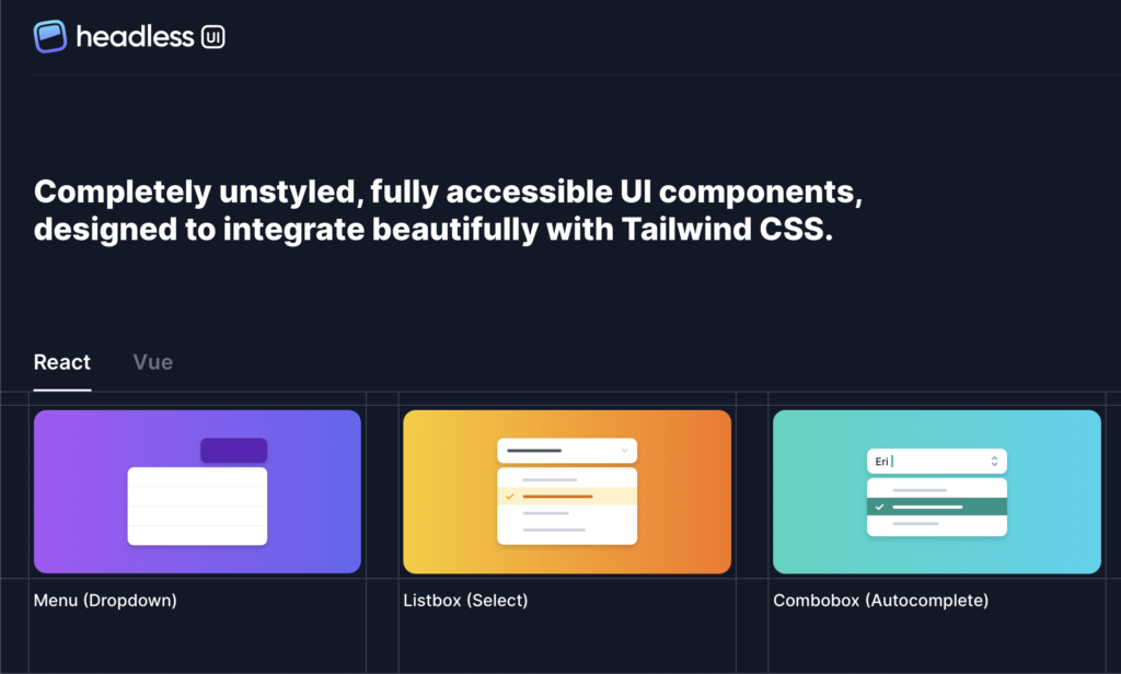
These are the components that complement Tailwind seamlessly. The point isn’t that Tailwind lacks components; it’s just that it’s not its primary purpose.
The Headless UI library, available for React and Vue, is the most popular, especially when combined with Tailwind, as the most flexible layout stack. It features 10 essential components that we can style freely, covering a wide range of use cases.
In any case, there are hundreds of headless components available on the Internet that we can include in our project to achieve the functionality we need.
To wrap up the topic of components, I invite you to visit the website https://tailwindui.com by the creators of Tailwind. Here, components created with Headless UI and Tailwind are showcased, looking great and ready for inclusion in our projects. We can customize them slightly to add our personal details.
Is Tailwind CSS the Same as Inline Styles?
Now that you know Tailwind in general terms, you may have realized one thing.
<div class="p-6 bg-white rounded-xl shadow-lg flex items-center space-x-4">
  <div>
    <div class="text-xl font-medium text-black">ChitChat</div>
    <p class="text-slate-500">You have a new message!</p>
  </div>
</div>
Doesn’t the way Tailwind structures its code resemble the inline styles that CSS guides strongly advise against? This is undoubtedly the aspect that new Tailwind users like least, but let’s think about it for a moment.
Although at first glance these strings of classes in the HTML tags are reminiscent of the inline style written directly in the style attribute of the elements, there are two fundamental differences:
Tailwind Classes Are Based on Our Design Style
Firstly, we’re not scattering magic values throughout our application’s HTML. Instead, we’re applying a set of enriched classes from our design system that Tailwind generates for use without hesitation on HTML elements. Spacing, colors, and typography rules are outlined in Tailwind’s configuration file.
Tailwind CSS Philosophy
The second and most crucial point is that if we find ourselves making this criticism, it means we’ve lost sight of Tailwind’s philosophy or haven’t truly grasped it in the first place.
In their documentation, they proudly emphasize that we don’t have to leave the HTML template while we are styling. This approach prevents us from writing thousands of lines of CSS and meaningless class names for each element. The outcome of using Tailwind is a project without CSS code to maintain. This is the feature I appreciate the most about the framework.
And what if we find ourselves repeating the same styles in different parts of the application? How can we reuse them?
Reusing styles in Tailwind CSS
The Reusing Styles page in the Tailwind documentation covers this scenario and provides various solutions for reusing styles in a project, depending on the technology you are using. For instance, if you’re developing with component-oriented libraries like React, Vue, or Angular, the recommendation would be to create smaller components for reusable parts that encapsulate layout details.
Additionally the component scope is the perfect place to connect the application’s data or JavaScript state layer to the CSS by conditionally adding Tailwind classes to our HTML elements.
@tailwind base;
@tailwind components;
@tailwind utilities;

@layer components {
  .btn-primary {
    @apply py-2 px-4 bg-blue-500 text-white font-semibold rounded-lg shadow-md hover:bg-blue-700 focus:outline-none focus:ring-2 focus:ring-blue-400 focus:ring-opacity-75;
  }
}
In my opinion, taking these two points into account, the criticism of inline styles against Tailwind is completely defeated. If you are still thinking like this, I insist that you have to give a chance to Tailwind. This way you will experience first-hand how your productivity improves.
Conclusion
As you can see, Tailwind is a very well-designed CSS framework that is indisputably fashionable in the world of frontend development.

Of course it is not perfect, but its maturity is evident in version 3, which is the latest to date.
I personally have been using it for about 2 years and for me it has become an essential tool for laying out CSS at full speed without wasting time learning an API such as Bootstrap, Material Design or Ant Design. Of course, CSS knowledge prior to using Tailwind must be high. At the very least know what each CSS property does.
We can create unique designs by working from scratch instead of modifying those that come by default in other frameworks. Depending on the level of customization we need in the project, designing from scratch will be the right decision or unnecessary work.
This is my contribution to the Tailwind CSS discussion. If you liked this article, share it with your coworkers and follow me on social networks to be informed of my upcoming publications.